
Tuesday, 13 December 2016
Friday, 9 December 2016
Front cover magazine collage

Target audience- 12 and over
Colours (Red/Black)- My group decided to use red and black for the front cover magazine collage as they are both colours that contrast. Adding on both colours are associated with strength so when a reader picks up the ,magazine he will feel strong and powerful. This has an effect on the audience as it makes them feel like they have power. The colour black can also be seen as a colour of mystery. This would make the reader want to read the magazine as they would want to know what the magazine is hiding inside. The colour red can be represented as determination. This would attract my target audience as they would want to feel motivated by the magazine as music may be something they want to do in the future.
Image (Music icon)- The music icon is laid out right in the middle of the page so that the reader can easily pick out that its a music magazine. The music icon is in white to show the magazine is pure. This has an effect on the audience as it tells them that they have freedom and that the magazine is for all ages.
Planning
Analysing the magazine I have noticed that we haven't included any images or cover lines. This was used to put mystery in the magazine having an effect on the audience as it will make them want to read it. I've also understood that colours have a huge part on the magazine as it's what represents the magazine and it makes the audience think about what the magazine is about.
Tuesday, 29 November 2016
Colours in magazines: Case study 1
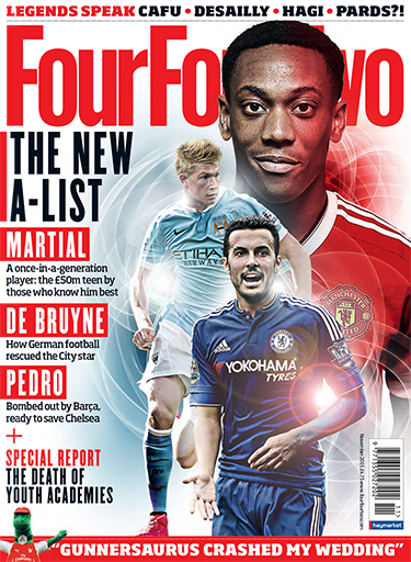
Three colours were used for this magazine. This may seem like a lot but its still set up so that it's easy to read and not confusing. The colours also look very good together making it easier to the eyes as it's not flashy. the colours also help to make words stand out to show the most important aspects of the magazines. All these colours represent the target audience of men from the age of 15 to 34
White- Goodness, innocence, purity, and virginity.Red- Energy, war, danger, strength, power, passion, desire, and love.
Black- Power, Strength,elegance, formality, death, evil, and mystery.
The colours black and red are both represented as power making the magazine seem like it's strong. This fits with the genre sport and how its to do with a football magazine as you have to be strong to be a football player.
Red is known as an emotionally intense colour. Red is a colour that represents energy, war, danger, strength, power, passion, desire, and love. This also links with the genre, football as football is also an intense sport in which anything can happen. This links with those who read the magazine as they can relate to the magazine, making them want to carry on reading it..
Black is a mysterious colour making the reader want to see what the magazine is hiding or showing. Black denotes strength and authority; it is considered to be a very formal, elegant, and prestigious colour. This links with the target audience as men are usually known as wanting to have authority.
White is known as a colour of goodness, innocence, purity, and virginity. This gives sense of how the magazine is perfect as angels are also often represented as white making us feel like the magazine is angel-like.
The colour red in the magazine is used to make specific lines or words stand out so that it shows the reader what are the most important moments in the magazine. Red and white are often put together in the magazine; this combination often represents unity. White in the magazine is used as a background for certain words and the background of the whole front cover. This is used as it goes in contrast with the colours black and red making everything stand out
Planning
Analysing the colours of the magazine I've realised that colours are important in making the reader feel an emotion reaction towards the magazine. This has made me think that when doing my magazine, I will think about the colours I put as I will want to make my reader feel intrigued.
Friday, 11 November 2016
Research-Representation (Magazine Front Cover)

In the Magazine the 'Rolling Stones' Jay Z is represented as serious, tough and feared. You have a close up of Jay-Z with a direct gaze which helps you to build a personal relationship with him. Within the mise-en-scene Jay-z is wearing all black clothing, black being seen as a connotation of power maybe representing Jay-Z. He is also wearing jewellery representing him as a wealthy man. They also make his face very vibrant, making him seem like he's full of energy and life (high-key lighting)
This commands the target audiences attention - the audience might fear him however they would want to be him. The composition of the magazine cover places his head over the iconic rolling stone branding itself. This not only shows he is more important then the magazine but that the magazine is mostly about him.
Planning
Representation is important in a magazine as it helps distinguish what the magazine is all about. From this analysis I have understood that most pictures on a front cover are what the audience want to be.

In the magazine of ''NME' Jay-Z is once again represented as serious, tough and feared. The magazines picture for the magazine is a close up, and a direct gaze towards the reader. This helps build a relationship with the reader. In the mise-en-scene I've noticed he is wearing black most of the time with some jewellery (necklace). This represents his power and his personality as black can also represent seriousness. The jewellery displays how he is wealthy. However they have only made half his face look vibrant and the other half look dark making the reader feel like he is hiding something or he is mysterious. In the cover line for the magazine it describe shim as 'He's the king og pop culture. He's superman." The connotation of 'king' also suits how he looks in the magazine as a king is also serious and wealthy. Furthermore the word 'superman' in black capitals connotes him as a strong man with bulging muscles.This is a key piece of intertextuality.
Planning
As I have analysed the magazines I've noticed that Jay-z is represented with the same personality in every magazine. This shows he's is trying to gain respect by everyone as he take his job very seriously with the emotions he shows. This once again tells me that the image in the front cover is always important as it's what helps represent the person.
Comparing
Comparing the two magazines, I've noticed that the magazines show Jay-z with the same emotions. This has an effect on the reader as it represents that Jay-z is the type who is concentrated on his joband makes the reader feel like hes indestructible. He also wears the same coloured clothing (black) in both magazines showing that he wants to also be recognised as someone who has authority and is mysterious. Adding on he also wears the same jewellery in both magazine telling the reader that he is a man who knows who he is and has his own personal style.

Wednesday, 9 November 2016


Thursday, 13 October 2016
Questionnaire
- How often would you expect an issue of the magazine?
- Who should the target audience be for a school magazine?
- What would you want to read in a magazine?
- Should the title just be a logo or have a catchy name/title?
- Should the front page have images? If so what would be most appealing?
- What colours should represent the magazine?
I have used these questions for my school magazine as it’s important to know what the reader would be fascinated by the magazine. All the questions asked are very important to know however one that stands out from the rest is “What would you want to read?”. This tells the reader that they are also part of the magazine as they give us the ideas but it’s also useful to the contents page as I will be able to put all the features in the magazine and show what page it’s on. Adding on I’ve also asked “How often would you expect an issue of the magazine”. I’ve asked this as it’s important to please the reader and listen to when they would want it.
Tuesday, 27 September 2016


Thursday, 22 September 2016
Magazine analysis of Q

Planning
In the magazine of 'Q' Florence is represented as someone who is majestic and queenly. You have a close-up of Florence with a direct gaze helping us build feel like we are close to the person as we are building a personal relationship with her. She also has blue eyeliner for the mise-en scene, the colour blue for her eyes may show she is someone who is graceful. They also show her nails as black showing that she may be full of mystery as from the cover-line it says 'Florence woman on the edge', making her very mysterious. Her face is also very vibrant, making Florence seem like her personality is full of life and she is full of energy. This makes it very appealing because when you look at her you see her beauty making you want to be her. However the title is over Florence telling the reader that she isn't the most important part of the magazine.


Subscribe to:
Comments (Atom)