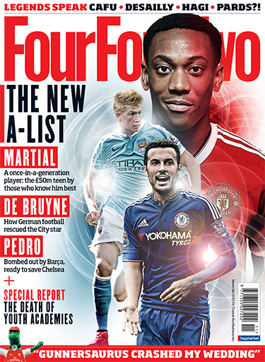
Three colours were used for this magazine. This may seem like a lot but its still set up so that it's easy to read and not confusing. The colours also look very good together making it easier to the eyes as it's not flashy. the colours also help to make words stand out to show the most important aspects of the magazines. All these colours represent the target audience of men from the age of 15 to 34
White- Goodness, innocence, purity, and virginity.Red- Energy, war, danger, strength, power, passion, desire, and love.
Black- Power, Strength,elegance, formality, death, evil, and mystery.
The colours black and red are both represented as power making the magazine seem like it's strong. This fits with the genre sport and how its to do with a football magazine as you have to be strong to be a football player.
Red is known as an emotionally intense colour. Red is a colour that represents energy, war, danger, strength, power, passion, desire, and love. This also links with the genre, football as football is also an intense sport in which anything can happen. This links with those who read the magazine as they can relate to the magazine, making them want to carry on reading it..
Black is a mysterious colour making the reader want to see what the magazine is hiding or showing. Black denotes strength and authority; it is considered to be a very formal, elegant, and prestigious colour. This links with the target audience as men are usually known as wanting to have authority.
White is known as a colour of goodness, innocence, purity, and virginity. This gives sense of how the magazine is perfect as angels are also often represented as white making us feel like the magazine is angel-like.
The colour red in the magazine is used to make specific lines or words stand out so that it shows the reader what are the most important moments in the magazine. Red and white are often put together in the magazine; this combination often represents unity. White in the magazine is used as a background for certain words and the background of the whole front cover. This is used as it goes in contrast with the colours black and red making everything stand out
Planning
Analysing the colours of the magazine I've realised that colours are important in making the reader feel an emotion reaction towards the magazine. This has made me think that when doing my magazine, I will think about the colours I put as I will want to make my reader feel intrigued.
No comments:
Post a Comment