
Tuesday, 31 January 2017
Monday, 23 January 2017
Double page spread: Case study 4

The image on the right side of the page is very big, making it the first thing you look at, This makes the reader know who is being interviewed as it shows Cafu the football player with a picture of him holding a trophy to demonstrate his success in football making him look like a top football player. The quote on the picture which states 'If I had joined Real Madrid maybe I wouldn't have become a world champion' which tells us instantly his football career was successful and that he enjoyed his time making the readers feel like he is a legend of the sport.
The red colours throughout the double page spread are used as a connotation as red is an extremely bold colour and signifies passion and fire which could connote the football players passion for the sport. The picture has also been made so he is standing on a football pitch to show once again his passion for football and how he can't get enough of the sport and will always love it. The emotions he shows by smiling and looking out into the open shows how he is happy when o on a football pitch or playing the sport having an impact on the reader as they gain respect for him as they realize its his passion.
The title ,'one-on-one' tells the reader immediately that this is an interview making them interested as the reader wants to see what the football player; Cafu has to say in the magazine. The rhetorical questions below the title are used to persuade or subtly influence the audience. Oftentimes, a rhetorical question is used to emphasize a point or just to get the audience thinking. The fact file also helps you get to know the player in case you had never heard about him. Also the way the 'Fact File' is in yellow which as a colour means joy links with the picture of the football player being joyful. Also the way the questions are put in bold writing to show his status from everyone of how he is much higher in the ranks and is different to everyone as all the answers are in the same plain writing.
Sunday, 22 January 2017
Contents page: Case study 3
The contents page for 'FourFourTwo' is very organised as its separated into different sections from Upfront, Features, Planet Football and performances. The use of numbers for the different articles makes it easier for the reader to navigate through the magazine in case they see something they might want to read. Half of the page is covered in pictures of sections of the magazine.This gives an insight on what the magazine contains, making it once again easy for the reader to navigate through the magazine as they know what is to come and what they might want to read the most. They have also made it so that nothing stands out on the contents page demonstrating to the reader that everything is as important as each other.
The titles of each section consist of different colours. The title 'Upfront' is in Red and White which is the same colours as the 'Stop' sign. This can have an effect on the reader as it will make them think that this section is very important as it's making you stop to read it carefully rather then just looking at it quickly, demonstrating its importance. The features title is in black and white, whilst white is often seen as a colour of purity and light and black is seen as a negative and dark colour this could show to the reader that this part of the section is full of negative and positive moments.The convergence of black and white (more so than any other colour combination) is an example of how two divergent colors communicate more powerfully together than they do on their own. Planet football is then in yellow and black which could have an effect on the reader as signs such as the hazard sign are often in yellow and black This has an effect on the reader as it makes you feel like there is a big article that can have an effect on you as hazard signs are often used for dangerous chemicals or materials. The performance title is in green and white, the colour green is seen a colour of growth making it seem like some articles are about the growth of players or managers.. The page numbers are in red making it easy for the reader to find the pages they want to read. Some of the numbers however are circled and are in black which could communicate to the audience that these are the most important articles in the magazine as the rest are all in red, making the highlighted black ones stand out.
The titles are also all in capital letters which makes them stand out, They are also in bold colours which makes it seme like the magazine is energetic, attracting readers that like to be energetic.
Planning
Analyzing the contents page it got me thinking that the contents page is very important in showing the reader the content that the magazine holds and its helpful in helping the reader navigate through the magazine and help them read the articles they are interested in.
Front cover: Case study 2
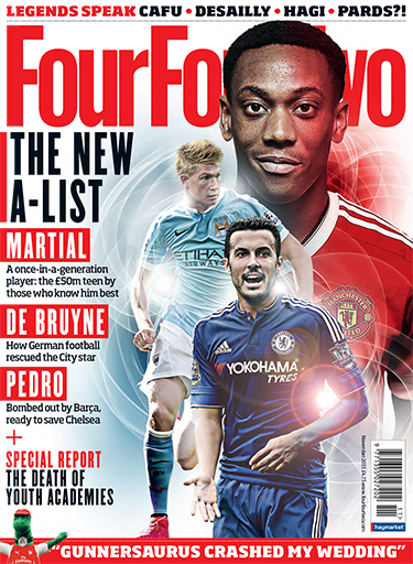
The title 'FourFourTwo' is the second largest piece on the page however it is still obstructed by the image demonstrating to the reader that it is not the most important part of the magazine. The title 'FourFourTwo' is in red which is often seen as a powerful colour which could have an effect on the reader as it will make them pick the magazine up as they also enjoy having power. We can instantly tell its a football magazine as the title 'FourGourTwo' is also used as a formation in football.
The Coverlines are all to do with the three football players from the image. (Martial, De Bruyne, Pedro). It contains details of what is int he magazine. This will attract buyers to get the magazine as they have been given a slight sneak peek of what is to come in the magazine, meaning they will buy the magazine as they want to read more.It's also in big bold writing making it one of the first things readers will see. This has an effect on the reader as they will realize that the names of the football players are the most important part of the issue.
The average price of a magazine is £3 however the 'FourFourTwo' magazine price is £4.75 demonstrating that the magazine is mostly for adults who work as teenagers and children would most likely not be able to afford the magazine.
The language in the magazine is mostly formal demonstrating once again this is for adults as other magazines targeted at children would mostly use friendly writing to make children feel comfortable. However in this magazine they use mostly informative writing to give the reader an insight on the magazine.
The image of the football players is the main part of the front cover as it's the first thing the reader will see when looking at it. The fact that the players are shining makes them seem like they are angel-like or perfect. Also the fact that Martial the football player is covering the title demonstrates to the reader that he is the most important person on the magazine and he is the main article in the magazine.
Planning
Analyzing the front cover of the magazine it has made me realize that it's very important to make it look perfect as it's important to have a good first effect on the reader. If the front cover doesn't look good, it will make the reader feel like the editor is careless and doesn't care about the magazine, making the reader feel like the magazine will be a bad read.
Friday, 20 January 2017
Editors Letter Analysis

The editor of the magazine, sounds like he is speaking to someone who he is close to as he is telling the reader about his opinions and help the readers with there music. This is something that usually a friend would do or someone that the reader knows.
The editor also uses colloquial language such as 'okay go read the issue then' to demonstrate that it's as if it's a normal conversation with a friend, making them feel like they have a friendship and a bond. This expands the target audience as it attracts those who want to feel at ease when reading a magazine.
The editor also tries to persuade the reader to read the magazine as he says things such as 'turn to page 6 to see just how angry we are' or 'my favourite thing in this weeks issue is the 10 page poster special'. This sense of intrigue makes the reader want to open the magazine and see what he is angry about and check out the posters.
The image of a man with the poster 'Bring the Noize!', this could be considered as slang creating once again a bond with the reader as it will show that the editor feels comfortable around the reader as he is speaking in a manner in which would usually be spoken with a friend.

Informal language such as 'thanks, gents' is used to make the reader feel like they are friends with the editor as the editor is speaking casually. It also helps connect with the audience ( those who enjoy music).
Words such as 'We' and 'Our' are used to make us feel like we are part of the team or there adventures. This will then make the reader want to carry on reading as he will want to see what other things the editor has to offer.
The editor is telling s a story demonstrating to the reader that the editor is comfortable telling his experiences to us, making us feel like we are friends with him.
Planning
Analysing the editors letter it has made me realise that it is important that the writer demonstrates that the writes cares about the readers opinion and wants to say everything that is going on so that the reader feels included in the writers adventures, This has made me realise, when doing my magazine it is important to communicate to the target audience.
Subscribe to:
Comments (Atom)