The title 'FourFourTwo' is the second largest piece on the page however it is still obstructed by the image demonstrating to the reader that it is not the most important part of the magazine. The title 'FourFourTwo' is in red which is often seen as a powerful colour which could have an effect on the reader as it will make them pick the magazine up as they also enjoy having power. We can instantly tell its a football magazine as the title 'FourGourTwo' is also used as a formation in football.
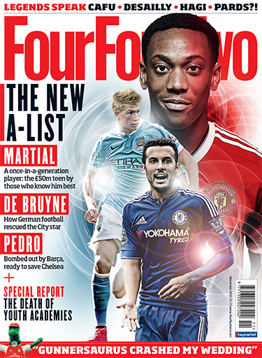
The Coverlines are all to do with the three football players from the image. (Martial, De Bruyne, Pedro). It contains details of what is int he magazine. This will attract buyers to get the magazine as they have been given a slight sneak peek of what is to come in the magazine, meaning they will buy the magazine as they want to read more.It's also in big bold writing making it one of the first things readers will see. This has an effect on the reader as they will realize that the names of the football players are the most important part of the issue.
The average price of a magazine is £3 however the 'FourFourTwo' magazine price is £4.75 demonstrating that the magazine is mostly for adults who work as teenagers and children would most likely not be able to afford the magazine.
The language in the magazine is mostly formal demonstrating once again this is for adults as other magazines targeted at children would mostly use friendly writing to make children feel comfortable. However in this magazine they use mostly informative writing to give the reader an insight on the magazine.
The image of the football players is the main part of the front cover as it's the first thing the reader will see when looking at it. The fact that the players are shining makes them seem like they are angel-like or perfect. Also the fact that Martial the football player is covering the title demonstrates to the reader that he is the most important person on the magazine and he is the main article in the magazine.
Planning
Analyzing the front cover of the magazine it has made me realize that it's very important to make it look perfect as it's important to have a good first effect on the reader. If the front cover doesn't look good, it will make the reader feel like the editor is careless and doesn't care about the magazine, making the reader feel like the magazine will be a bad read.
No comments:
Post a Comment